Foodlink
Brand Brochure Creation | Editorial Design
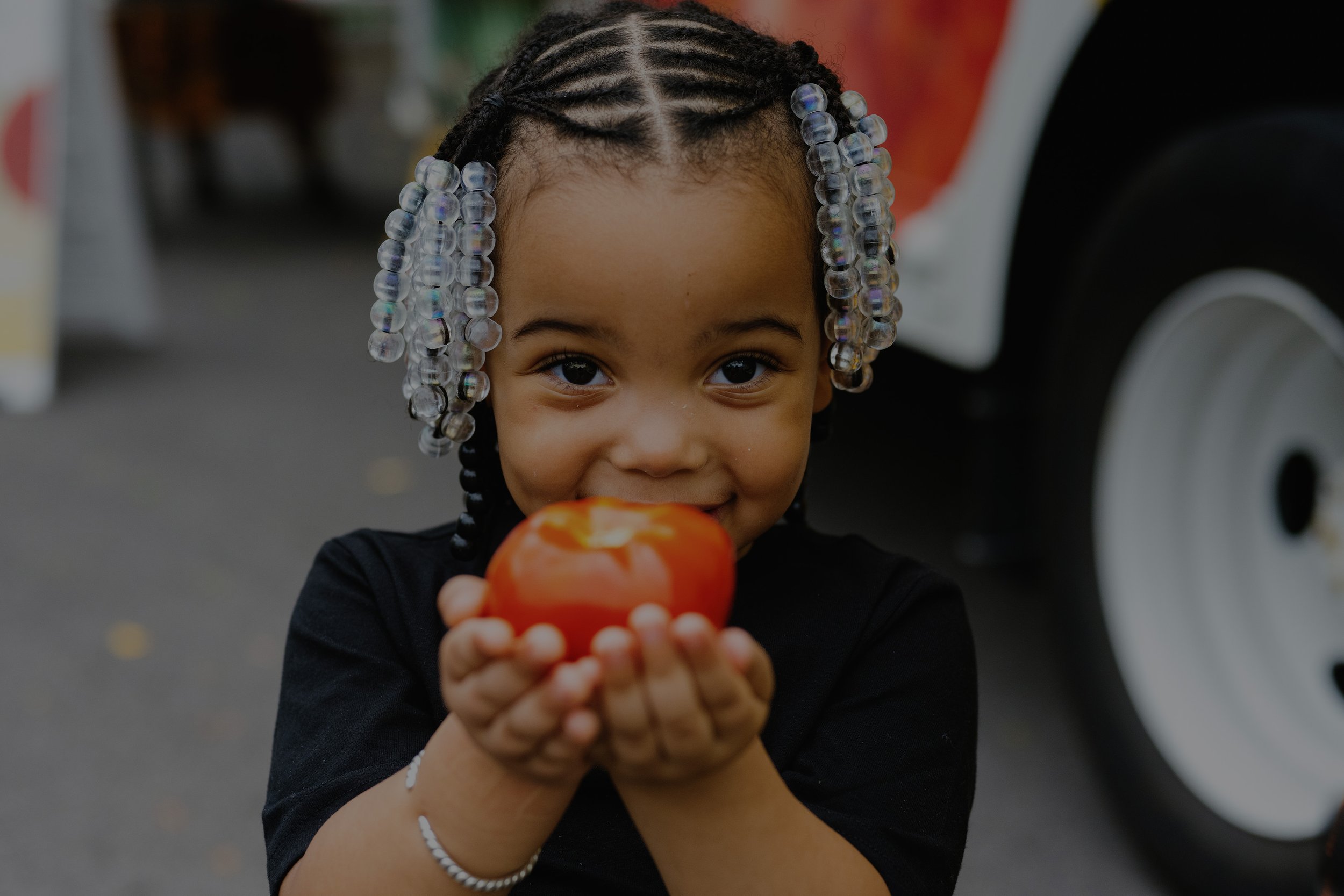
I designed a brochure for Foodlink to provide an overview of their programs and services, and to guide readers to their website for more information. I adhered to Foodlink's style guide, using their square shape language and vibrant color palette. By leveraging real lifestyle imagery, I was able to bring the brands mission and authenticity to life.

Creative Process – What is your reasoning behind these design choices?
Chose to focus on only three key colors from Foodlinks’ extensive style guide to create a sense of balance and cohesion within the brochure's busy design.
Incorporated Foodlink’s high-quality images prominently on each page, leveraging their visual appeal to make the brochure more engaging than text-heavy designs.
Implemented Foodlink's unique brand tiles throughout the brochure, using them as design elements and background accents to maintain brand consistency.
Used diagonal grids and elements to break up the layout, adding dynamic movement and visual interest in contrast to the rigidity of traditional straight grids.


