Nova Skincare
Brand Development | Product Design | Promotional Collateral
Nova is more than a skincare brand; it's a movement celebrating inner vitality and self-confidence. Embracing the “look good - feel good” philosophy, Nova empowers young adults to feel confident and powerful in their own skin. The name ‘Nova’ comes from stars that suddenly illuminate with immense energy, and with our new lightweight, hydrating moisturizer, Nova strives to make each person shine just as brightly.

Creative Process – What is your reasoning behind these design choices?
To evoke a lightweight, natural aesthetic, I chose soft, earthy tones, delicate lines, and clean, minimalist typography, along with an elegant celestial name.
The meaning of ‘Nova’ is defined as “a star showing a sudden large increase in brightness” which reflects our goal of providing your skin with a radiant, renewed glow.
The intricate line art on each bottle offers an abstract representation of the different lotion types—face, hand, and body.
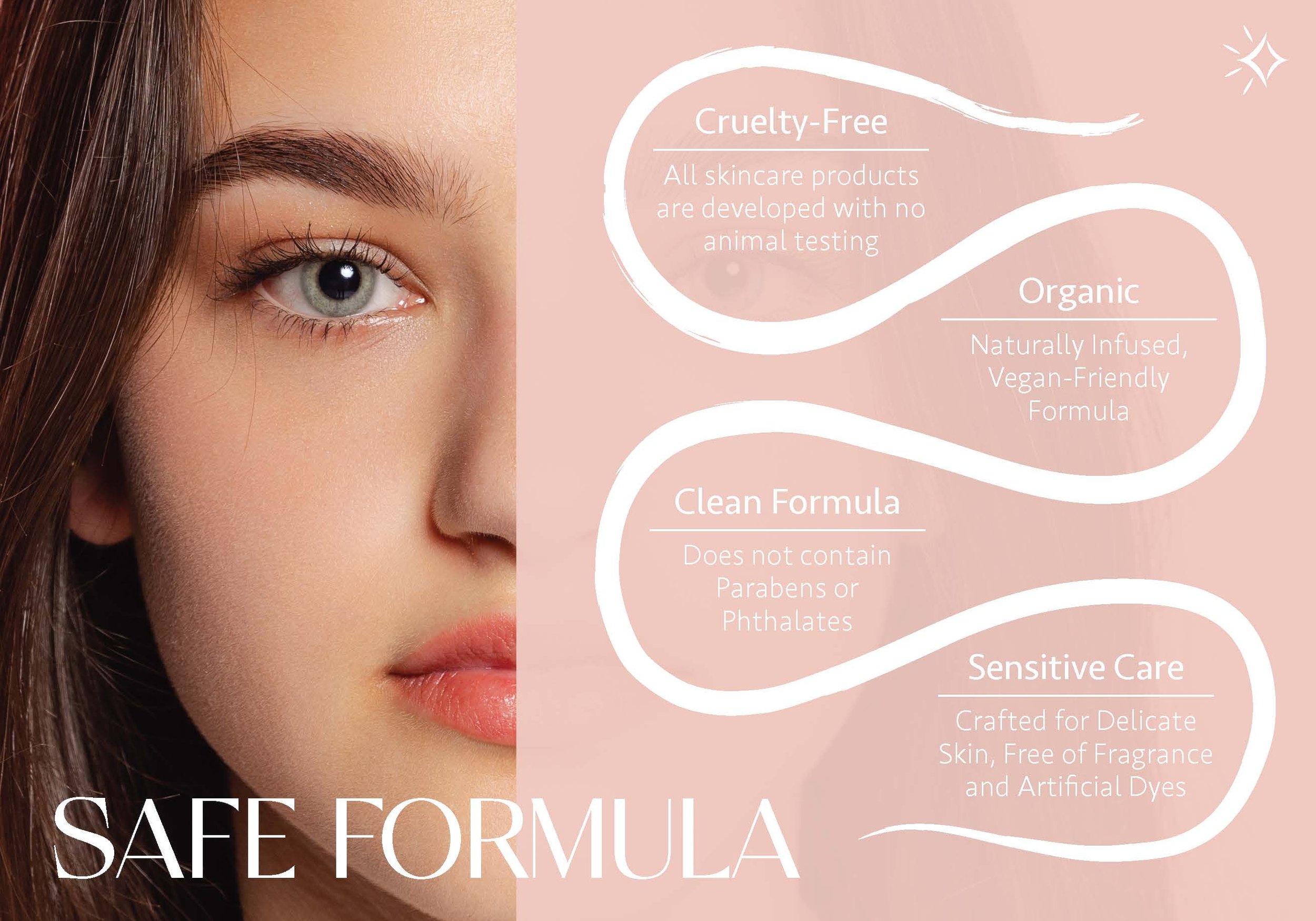
Nova embraces a "look good, feel good" philosophy, a theme that is consistently highlighted throughout the brochure, effectively reflecting the brand's core values.


